You may have noticed how often you see sans-serif typefaces like Helvetica in corporate publications? Not to mention photos rather than drawings. Typography as a design element. Asymmetric layouts that use a grid. Those all come from the International Typographic Style, a school of graphic design dating back to the 1930s. If you’ve heard of the Swiss Style, it’s pretty close to the same thing.
One of the top practitioners of Swiss Style design, at least in the US, was Paul Rand, who was born August 15, 1914 in New York. His birth name was Peretz Rosenbaum. Even as a boy he loved art and design, and painted signs for his elementary school as well as his father’s grocery store. His father, though, distrusted art as a way to make a living, and insisted that his son pursue a “conventional” education and, if he wanted art classes, he had to take those at night. That’s exactly what Rand did, and attended Parson’s School of Design and the Art Students League of New York only during night sessions.
Rand’s first jobs involved creating stock graphic images for newspapers and magazines. Around that time he changed his name to “Paul Rand,” taking advice from an associate who said he “figured that ‘Paul Rand,’ four letters here, four letters there, would create a nice symbol.” A later observer said “Rand’s new persona, which served as the brand name for his many accomplishments, was the first corporate identity he created, and it may also eventually prove to be the most enduring.”
Rand’s work began to get international attention in the 1930s when he was producing covers for Directions magazine. He did the covers for free in exchange for having a free hand in creating the designs. A professor in the Bauhaus school at the time observed that “Among these young Americans, it seems to be that Paul Rand is one of the best and most capable.” His reputation increased when he designed the page layouts for an important magazine’s anniversary issue. The magazine was Apparel Arts, which is now known as GQ. Rand was still only 23, but was offered the position of art director for the Esquire-Coronet group of magazines.
He did art direction and graphic design work throughout the 1930s and 1940s, and became regarded as one of the world’s top designers. That led to the work he’s most remembered for: corporate identities and logos, which he developed in the 1950s and 1960s. IBM, ABC, Cummins Engine, UPS, and for that matter, Cisco, owe their graphical language and heritage to Rand. As another top designer, Louis Danziger, put it, “He almost singlehandedly convinced business that design was an effective tool. [. . .] Anyone designing in the 1950s and 1960s owed much to Rand, who largely made it possible for us to work. He more than anyone else made the profession reputable. We went from being commercial artists to being graphic designers largely on his merits.”
Rand died at 82 in 1996, but had continued working nearly to the end of his life, reputedly earning $100,000 per design. One of his later, super-influential designs was the logo and corporate identity for NeXT Computer. He reputedly also had an influence on the industrial design of the computers themselves, which were unusual and striking. (And pretty good systems; one of them was used to design the World Wide Web). As a designer to the end, Rand asked his colleague Fred Troller to design his headstone. It’s in a cemetery in Norwalk, Connecticut, and it, too, is striking.
Rand wrote three books: Paul Rand: A Designer’s Art (1985), Design, Form, and Chaos (1994), and From Lascaux to Brooklyn (1996). Paul Rand: A Designer’s Art was released in a new edition in 2016.
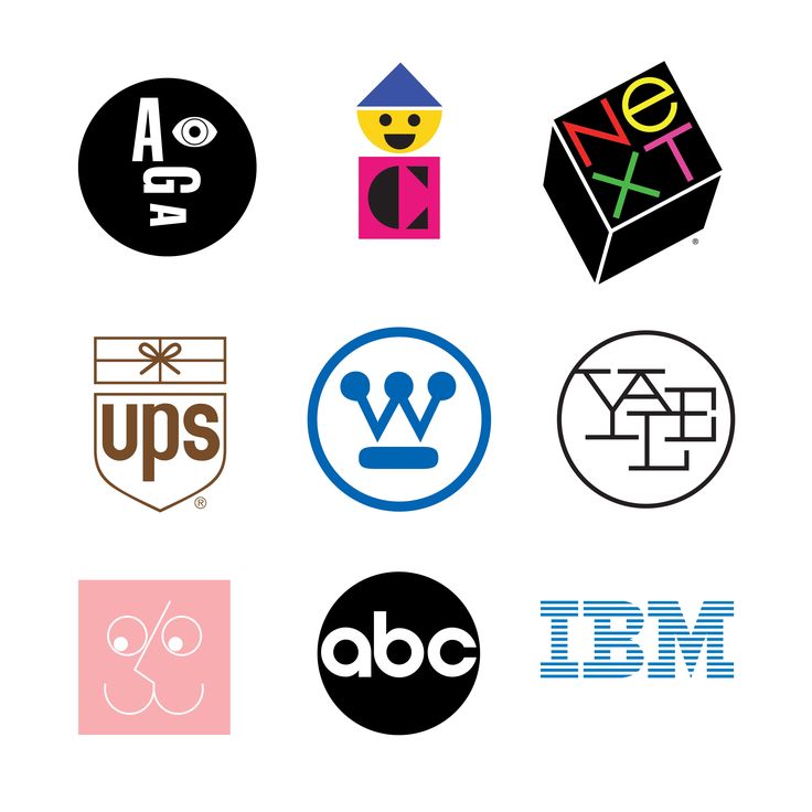
A tiny selection of Paul Rand-designed logos.