It’s a mysterious thing, how people can so easily understand maps. You can unfold a map, show it to a very small child, and it won’t take them long to “get it.” They’ll even understand the limitations of maps (or possibly the limitations of paper); if you try to tell them they can peer very closely to see themselves from above, they’ll usually know you’re (a) not being serious, or (b) up to something and trying to trick them.
Maps help us feel situated. You might never have ventured down a particular road, sailed across that lake, or scaled a mountain to see what was on the other side, but with a map you can feel like you know the place. That “knowing” is an act of trust; you believe the map maker understood the mapped area and created an honest representation of it. When you feel situated because you have a map, it’s because you’re part of a social contract of a sort. You can rely on representations of the world around you because you can trust the countless unseen processes in your society and the people working at them. You can rely on a map for the same reasons you aren’t afraid of someone’s car ramming you from behind when you stop at a traffic signal, and for the same reasons you aren’t afraid to eat the food you buy. Maps are demonstrations of trust.
It hasn’t always been this way. At other times, and in other places, the world has been a dangerous place in different ways than we experience now. There have been times and places where people have had to worry about being poisoned. Or hexed. Or lynched. Or lost at sea because they relied on a map that only represented the mapmaker’s imagination or stories the mapmaker listened to. And yet having a map can be grounding, even if you do have some notion that it might not match your reality. After all, fantasy novels often include maps. In fact, a lot of them start with maps; a map of the fantasy world is often right there in the front matter, before the story begins. People understand the world through stories, and beneath the stories are maps.
Prehistoric cave paintings in Lascaux include what appears to be a map of stars, including Vega, Deneb, and Altair. Even older, a mammoth tusk discovered in the Czech Republic shows carvings that seem to represent a river and possible paths. It’s over 25,000 years old. By the time the Babylonian civilization arose, they were making maps on clay tablets, inscribing cardinal directions, and indicating things like the sizes of plots of land. Later, in ancient Greece, the first map of their known world (as far as we know) was drawn by a philosopher named Anaximander. We still have descriptions of his map written by people who saw it, but the closest representation of the map itself is another one drawn by Hekataeus, a student of Anaximander. He drew it about 50 years later, but said it was based on his teacher’s work.
Historical mapmakers had to either personally visit the places they mapped, or they relied on information provided by travelers, sailors, and visitors. Gerardus Mercator used the latter method. He was born on March 5 in 1512 in Flanders (in what’s now Belgium), and amassed an extensive library of books and maps. He was also a prolific letter-writer, and corresponded with virtually anyone who travelled, or even lived far away. Mercator used all those resources to make globes and maps, and, eventually, was the first to bind a set of maps into a single book, which he called an Atlas. He used the term to memorialize Atlas the Titan from Greek myths; Mercator called him the first geographer. Atlas, of course, was the Titan usually depicted as carrying the entire earth on his shoulders.
Mercator wasn’t just drawing maps and constructing globes as a hobby; he sold them and earned a very good income. He also built and sold things like astrolabes and astronomical rings. Neither of those items are used any more. An astrolabe is a handheld instrument that’s a model of the universe (as it was understood at the time) and an analog calculator you could use to figure out an astronomical position. If you wanted to know when Venus would be visible in your location, and how far above the horizon it would be, you could use an astrolabe.
An astrolabe is a more-or-less flat disk with various moving parts, but astronomical rings form the skeleton of a sphere, which each of three rings to show positions in space. If you had a set of rings — especially if you could afford a set from Mercator himself; he made the finest in the world — you could use it as a sundial, or you could use it the same way as an astrolabe — and it would give you more information, because it was a more complex instrument.
You may find the name Mercator familiar, particularly in relation to maps. That’s probably because of a map of the world he created in 1569; it compiled all the information about the world available to Europeans at the time, and Mercator arranged the map in the form of a “projection” — a way to represent the surface of a globe on a flat surface. Mercator’s greatest innovation may have been that projection; he designed it so that if you were sailing a straight course in the ocean, and plotting it on his map, your course followed a straight line. It’s not really a straight line, of course — in real life you’re on a globe, so your course is along a curve. But providing a chart where sailors could use a straight line to represent what they experienced as sailing in a straight line proved to be outstandingly useful. And that’s why you’ve heard of Mercator; that projection is still used in modern navigational maps.
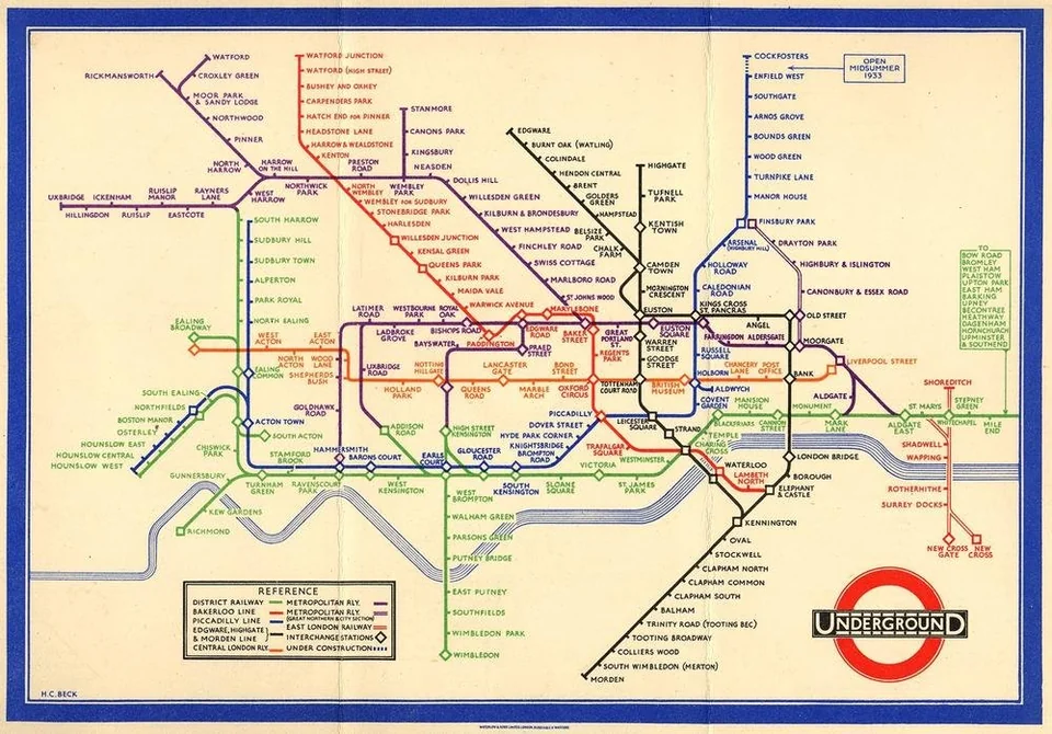
That’s a distinction worth thinking about. Maps can have different purposes; a map used for navigating an ocean looks one way, while a map used for navigating a city’s public transportation system looks very different. The type everyone is familiar with is the one created for the London Underground in 1931 — it’s still known as the Tube Map, and city transportation system worldwide now use that kind of schematic representation.
A schematic map shows connections, routes, and probably roughly indicates relative distances, but doesn’t look anything like what you see for real. A Mercator map shows sailing courses (technically, “rhumb lines”) as conveniently straight lines, and represents things like landmasses and their positions, but also doesn’t look like what you see for real. In fact, that’s the whole idea of a map; it doesn’t look like real life; it summarizes and represents only some significant aspects of a part of the world. Even globes, which are the right shape, haven’t until very recently been able to look like what you might see for real. That’s because until very recently nobody had ever had that kind of view.
Fred Hoyle was an astronomer who speculated, in 1948, that “once a photograph of the Earth, taken from the outside, is available, a new idea as powerful as any in history will be let loose.” Starting in the 1960s, when space programs first launched people into orbit, Hoyle’s idea has been tested. In fact it was the photo of the Earth taken from Apollo 8 in an orbit around the moon that’s been credited with inspiring the entire environmental movement. People suddenly began to perceive things differently, and the things they cared about changed.
That change in perception is called the overview effect. It’s the change in your thinking when you can perceive the actual earth as if it were a map — except now it’s real. Not a summary of routes, or rhumb lines, or political boundaries, or edges of oceans were you might encounter dragons. The actual thing. Here’s a film compiled from images from the International Space Station that shows what the experience is like, and why we could all use a little cognitive shift in the direction of the overview effect.