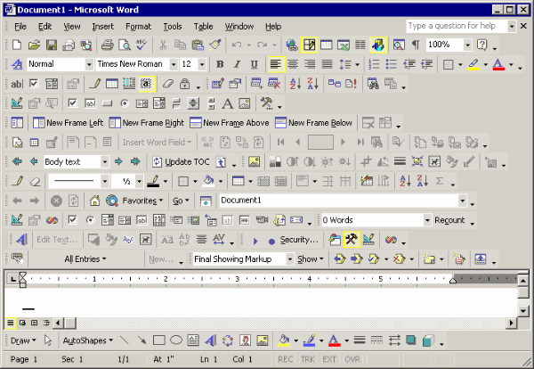
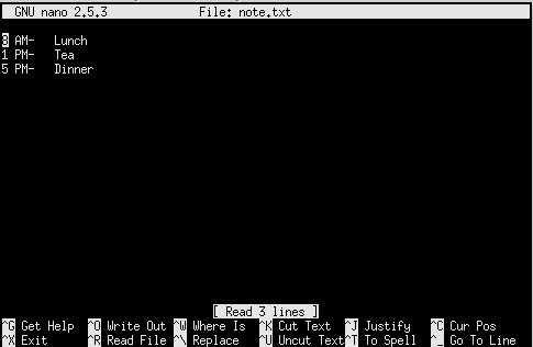
Computers and their cousins — smartphones, tablets, and so on — are supposedly easier to use nowadays, right? In the early days, you had to know a set of “commands” and enter them into the computer by typing them. Often there wasn’t much, if any, on-screen help. Now we’ve got little pictures (icons) and ways to point to them (a mouse or even your finger) and ways to take actions at any place on the whole screen, not just on a single line of words (or word-like things) at the top or bottom of the display.

The big difference is the graphical user interface — the “GUI.” The GUI’s takeover of the world of computing is pretty complete. Unless you’re firmly entrenched in the ultra-geeky end of technology, administering a whole company computer network or writing the words (or word-like things) that enable computers to work, your interaction with most of the computers in your life (and there are a lot of them) is mostly through various GUIs. You almost certainly have a smartphone, and those are pure GUI gadgets. There is a non-graphic interface to them, but it’s pretty difficult to get to, and hardly anybody wants to anyway. You most likely have a computer of some sort, and it’s almost certainly running a GUI. GUIs, by the way, are things that computers “run;” they’re just programs, and as such they’re made out of words (and word-like things). You can bypass the GUI on most computers I know of, but you have to know how to do it, and once you do your options for using the computer are different. Not less — in fact, almost certainly more — but pretty different.

This world of GUIs has been built by people with a job that’s only relatively recently come into existence: the user-interface designer (or user experience — “UX” — designer). You can get a university degree in this field, and many, many people have done that, and have jobs turning out GUI designs for a vast array of companies. They’re good jobs, too. They pay well, and are regarded as reasonably creative pursuits that help people use various technical products, whether they’re banking systems, shopping applications, or really almost anything else. This is widely regarded as a Good Thing, and if you’re a user-interface designer you probably regard your work as a net positive contribution to the world. Or at least to society.
What if it’s not, though? What if the overall effect of years of GUI design and development actually have a negative effect on society? What if, as a UX designer, you’re helping ruin things for everybody? There is a reasonable argument that you are. Let me explain.

I’ll start by pointing you toward David Macaulay’s books: Cathedral (his first), The Way Things Work (his best-known), and many others. Macaulay writes and illustrates books that explain things both in function and genesis, so that you understand the things in a deeper and richer way. He’s previously said that the tendency to hide the real mechanisms and systems that make things function is a problem, and not just for the technical people we increasingly depend on to fix our stuff. It is a problem for them, of course.

If you’re an automobile technician and you need to get to the engine of a new car, after you open the hood you’re likely to have to open a second set of covers that hide the engine. You could argue that the hood itself is unnecessary, although maybe it has a use in keeping the electrical components dry and improving aerodynamics. But the second set of engine covers exist solely to make the engine look better when you open the hood. I suspect it doesn’t look better to technicians, though.

If you’re a computer technician, you’re familiar with the command-line interface that lies beneath the “cover,” because you often can’t do what you need to do with just the GUI. Covering up the way things really work makes it harder for the people who need to know, and need to make adjustments, repairs, alter settings, and keep things running smoothly, whatever the things are.

I think Macaulay’s contention that this is also a problem for the rest of us has to do with several things. It creates an illusion that we don’t need to know much about how our stuff works. Just press this key and the letter “a” appears on screen; click that icon and your picture is “automatically” moved to your album, or your page. Humans seem to have a peculiar talent for ignoring and denying things. If the systems and devices and tools we surround ourselves with suggest that they just work, and never mind how, that’s fine with us. The problem with that is that too many people will never take the next steps and begin to understand how their stuff works.

There’s an instrumental problem there — we might be able to correct things ourselves more quickly and easily, but without information and understanding, that option is gone. There’s a social problem too, and it has to do with mutual respect. Fixing a car, or a computer, or a water heater, or really anything requires understanding and skill and a particular kind of attitude. If you don’t know anything about what’s involved, how are you going to respect the folks who worked hard to acquire that understanding and skill? You’ll probably just regard them as “your servants.” That has to do with another characteristics humans are susceptible to: egocentrism. Each of us is the center of our own little perceptual universe, and perhaps it’s natural to think that the things we do are more central — more important — than what anybody else does. Even if what we do is play Fortnite, and what somebody else does is setting up the system that lets us into Fortnite in the first place.
Would it help to change industrial design so mechanisms are celebrated instead of hidden? Would it help to change UX design so we have to be interacting with our computer systems slightly more directly? I don’t know — but I suspect it might. You can try it yourself, of course — if you have a MacOS computer, find the terminal program (it’s in the Utilities folder inside your Applications folder). On a Windows system you’re looking for the “command prompt,” and you can get there quite a few different ways. On an Apple iOS device like an iPhone or iPad it’s a little more complicated; you’ll need to install a CLI app. There are similar tools for Android and Chrome devices. And if you happen to be a UX designer, I’m not suggesting you find a new career — although that’s exactly what I did.
