It’s a somewhat puzzling state of affairs. There are quite a few characters and symbols we routinely use in addition to the regular alphabet; things like “@,” “#,” and even the common “*.” These commonly used symbols don’t have consistent names. But there are also many other characters and symbols that are only in use by specialists. These include “[,” “‡,” and “‽” — but these have names.
For instance, take the humble “#.” This is sometimes called a “pound sign.” But it’s also just as commonly called a “number sign” or a “hash mark.” If you’ve ever encountered any old technical information about the pre-cellular US telephone system, the “#” appeared on both rotary and pushbutton phones manufactured by AT&T, and it had an official name: the “octothorpe.” Similarly, the “*” symbol is called an “asterisk,” a “star,” “wildcard,” “zero,” “splat,” and “Kleene closure.” But if you have three of them arranged in a little pyramid (like this: ⁂), it has only one name: an “asterism.” It’s a symbol used in typography to draw attention, but it’s so obscure it’s pretty difficult to figure out how to insert it in text. Because it’s not easy to type, even on modern computers, it’s often replaced by this: ***, which also has a name: it’s a “dinkus.”
If you turn on “invisible symbols” in your word processor (or if you’re driven nuts because they’ve been turned on for some reason and you don’t know how to turn them off), you’ll see these at the end of every paragraph: ¶. In Microsoft Word it’s sensibly called the “paragraph marker,” but more officially it’s a “pilcrow.”
Most people know that % is a “percent sign,” but there’s also ‰ — that’s a “per mille” sign. Some other moderately common symbols that have names that most people don’t know include the square bracket [ that’s really a “crotchet,” the angle bracket > that many people call a “greater than” sign because that’s how it’s used in math, but is more accurately known as a “diple.” Even the ampersand (&) has another name: the “ipseand.”
By the way, the ampersand looks the way it does because it was originally a “ligature”; two letters combined into one. The ligature you most commonly see is probably the “ae” combination: æ. The ampersand is formed from “e” and “t,” which together form the Latin word “et,” which means “and.” The form of the ampersand has evolved over the centuries so it’s not easy to see where it came from, but if you install the Caslon font and type an ampersand it’s much clearer. Caslon was designed by William Caslon, who worked in London between 1692 and 1766 and created typefaces out of metal — which is how it was always done until the pixel was discovered in the late 20th century. I think they found the first one deep in a mine under Cleveland.
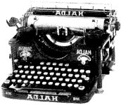
Speaking of the 20th century, that’s when the ‽ was invented. It’s called an “interrobang,” and was designed in 1962 by Martin Speckter. He worked in the advertising industry, and thought ad copy would look better if, instead of having to resort to constructions like “you haven’t tried the new frosted flakes yet?!??!??,” they could use a single symbol. He introduced the interrobang is a magazine, TYPEtalks, and invited readers to help name it. According to Wikipedia, failed contenders included “rhet” (for “rhetorical question”), “exclamaquest,” “exclarotive,” and “quizding.” The “bang” in “interrobang” comes from the name of the “exclamation mark” in both typesetting and, nowadays, computer programming: “bang.” The interrobang was built into some typewriters in the 1960s and 1970s, and for a while it appeared that the symbol was on its way to common usage. It didn’t make the transition to computer-based word processing though; most fonts don’t include it. Nowadays if you included ‽ in a draft submitted for publication, editors would either look † † (daggers) at you or maybe just insert an ironic ‡ (a “double dagger,” or “diesis”) on ℀ (account of) it being ∉ (not an element of) their accepted list. For some editors, ‽ simply ∄ (does not exist).
